March 22nd, 2016 by Kyle Larson
Apple updated its iPhone a bit ago making the form factor
much bigger. The iPhone 6 screen size is both wider and taller and the
iPhone 6 Plus also has a higher pixel density. This is an update to my
previous post about designing websites for the iPhone 5. It’ll cover
these new screen sizes and try to clarify how this all works.Update: Apple has released the iPhone 6s and iPhone 6s Plus. The iPhone 6s screen size is identical to the previous iPhone 6 versions, so feel free to follow the existing sizes below.
Update 2: Apple has released the iPhone SE which is the same size as the iPhone 5.
iPhone Screen Measurements
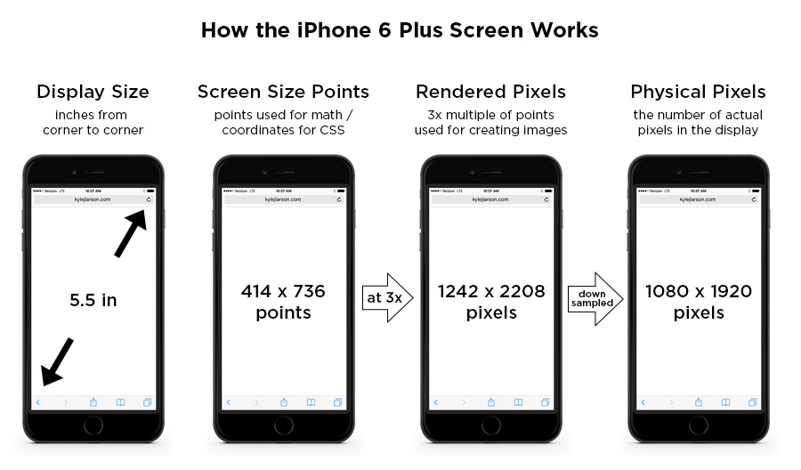
There are a few different values to consider when looking at the iPhone screen sizes. I’m going to get these values defined here so the chart below makes more sense:iPhone Display Size (inches) – This is diagonal measure of the screen, from corner to corner, just like you’d measure a TV.
iPhone Screen Size (points) – These points are the size that the device is using for coordinates. If you’re designing for the web (using CSS or JavaScript) these values will be helpful. iPhones use Retina screens which have a higher pixel density. This means they take the larger iPhone resolution (mentioned above) and compress those pixels into a smaller space to make the image look sharper.
iPhone Rendered Pixels – This is the full number of pixels that are being rendered. This is the value you get when you apply the multiplier (1x, 2x, 3x) the device uses to the screen size in points. If you’re creating an image and want it at the max resolution, this is the size you’d use. I’ve also written an article on Retina images if you’d like to learn more.
iPhone Physical Pixels – This is the actual screen’s pixel resolution. The iPhone 6 Plus is using a a larger image resolution on a screen with a smaller number of physical pixels, so it needs to be downsampled to this size. This value is really only important in a specifications perspective, but shouldn’t really affect your designs.

iPhone Screen Size Comparison
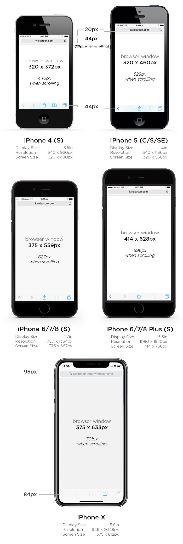
This image shows the browser screen size of the iPhones for use when writing CSS. See the table below for all the measurements of each phone. If you’re using iOS 8 the Safari menu height is consistent across all the iPhones.
| iPhone 4 | iPhone 5(SE) | iPhone 6 | iPhone 6 Plus | |
|---|---|---|---|---|
| Display Size | 3.5 in | 4 in | 4.7 in | 5.5 in |
| Screen Size | 320 x 480 points | 320 x 568 points | 375 x 667 points | 414 x 736 points |
| Rendered Pixels | 640 x 960 (@2x) | 640 x 1136 (@2x) | 750 x 1334 (@2x) | 1242 x 2208 (@3x) |
| Physical Pixels | 640 x 960 | 640 x 1136 | 750 x 1334 | 1080 x 1920 |
| Pixels Per Inch (PPI) | 326 | 326 | 326 | 401 |
| Browser Size Portrait | 320 x 372 px (320 x 440* / 320 x 460**) |
320 x 460 px (320 x 528* / 320 x 548**) |
375 x 559 px (375 x 627* / 375 x 647**) |
414 x 628 px (414 x 696* / 414 x 716**) |
| Browser Size Landscape | 480 x 212 px (480 x 280* / 480 x 300**) |
568 x 212 px (568 x 280* / 568 x 300**) |
667 x 267 px (667 x 335* / 667 x 355**) |
736 x 306 px (736 x 374* / 736 x 394**) |
** – measurements without any browser chrome for a web app
Note that the iPhone 6 Plus is a 3x screen. For the previous iPhones you can double the screen size values to figure out the max size of your retina image, but on the iPhone 6 Plus you’ll want to triple that value (i.e. a full screen graphic would be 1242 x 2208).
Using the iPhone 6 Screen Size for Web Design
If you’re coding your site using Responsive design in order to fit the iPhone well, you may have some sizing issues if you don’t tell the device not to zoom in. You can do this by adding this viewport metatag into the head of your site:<meta name="viewport" content="initial-scale=1.0">iPhone 6 Startup Screen
If you’re going to be setting up your website so users can save it and run it as a web app you can add a startup image to display when the page is loading.First add the web app meta tag (also make sure you’re not using a width in your viewport meta tag as this can cause issues):
<meta name="apple-mobile-web-app-capable" content="yes" />| iPhone 1 – 3gs: | 320 x 460 px |
|---|---|
| iPhone 4 – 4s: | 640 x 920 px |
| iPhone 5(SE): | 640 x 1096 px |
| iPhone 6: | 750 x 1294 px |
| iPhone 6 Plus: | 1242 x 2148 px |
<link rel="apple-touch-startup-image" href="images/ios_startup.png">
<link rel="apple-touch-startup-image" href="images/ios_startup@2x.png" sizes="640x920">
<link rel="apple-touch-startup-image" href="images/ios_startup-large@2x.png" sizes="640x1096">
<link rel="apple-touch-startup-image" href="images/ios_startup-6@2x.png" sizes="750x1294">
<link rel="apple-touch-startup-image" href="images/ios_startup-6-plus@3x.png" sizes="1242x2148">
iPhone 6 Icons
When designing iPhone 6 icons you’ll notice there is a new size for the higher pixel density iPhone 6 plus. If you’d like to add an icon to your site that people will see when they save it to their homescreen, take a look at my article on creating an iPhone icon, which includes the sizes you’ll need.====================
https://www.google.com/search?q=rendered+pixels+vs+physical+pixels&biw=1366&bih=633&tbm=isch&tbo=u&source=univ&sa=X&sqi=2&ved=0ahUKEwiAuKK19dXLAhVnKKYKHZYtCMkQsAQIPQ

Impressive and powerful suggestion by the author of this blog are really helpful to reduce our hack-tic life. My own views are matching with author and I have experienced such.ร้านค้าออนไลน์
ReplyDeleteThere's no doubt i would fully rate it after i read what is the idea about this article. You did a nice job.. We Stock all major Brands
ReplyDeleteNice blog and absolutely outstanding. You can do something much better but i still say this perfect.Keep trying for the best. Copier Recycles SA
ReplyDeletenice post...thanks for sharing the information.keep update with your blogs..
ReplyDeleteweb designing company in Hyderabad
best website designers in hyderabad
website designers in ameerpet Hyderabad
This is my first time visit to your blog and I am very interested in the articles that you serve. Provide enough knowledge for me. Thank you for sharing useful and don't forget, keep sharing useful info: best web development usa
ReplyDeleteYour post is providing some really good information. I liked its essence and enjoyed reading it. Keep sharing such important posts about this blog and its much more helpful for us .
ReplyDeletezwangerschapsmassage amsterdam