Wednesday, March 23, 2016

What's a Pixel?

https://developer.appway.com/screen/ShowSingleRecipe/selectedRecipeId/1429057950522
Created by L. Mathis on 27.11.2014 

Problem 
A lot of Screen components in Appway ask me to enter pixel values. For example, the Adaptive Flow Layout has properties like these.


However, my phone has a 400 DPI screen, meaning it shows 400 pixels per inch. My PC only has about a 100DPI screen, so it only shows about 100 pixels. Does this mean that the same value is four times larger on a PC than on a phone? What exactly does "pixel" really mean?
Solution
This question would have been really easy to answer a decade ago: "A pixel is the glowing little dot on your CRT screen." Unfortunately, we don't have these screens anymore, and pixels don't really mean that anymore; at least not the kinds of pixels you're entering into a Screen component property.

There's a short answer and a long answer to your question. Let's start with the short answer.

The Short Answer

A pixel in Appway is a unit of length that appears to be very roughly the same size on most devices. Typically, it's roughly 1/100th of an inch. It has nothing to do with the glowing dots on your screen, unless you happen to have an older computer that has very large dots on its screen.

The Long Answer

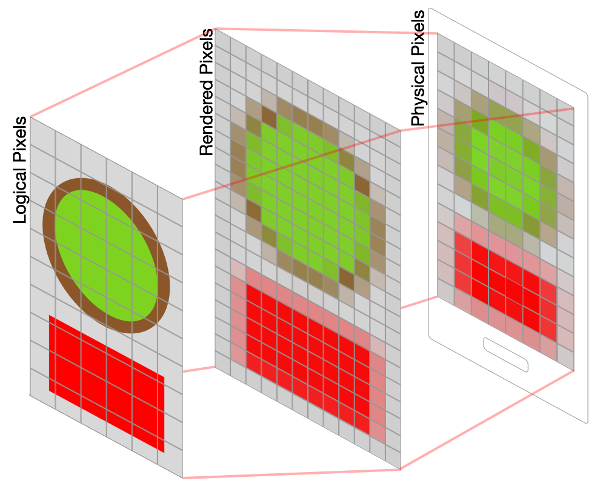
To understand exactly what a pixel in Appway actually is, one needs to understand what happens when a computer renders an Appway screen, because during that process, different kinds of pixels are involved:

  • Logical pixels
  • Rendered pixels
  • Physical pixels

Logical Pixels

First, we start out with logical pixels: That's what you enter into a component's properties field. It's not really a pixel at all; instead, it's a rough measure whose length is "about what a pixel used to be, back when there was only one kind of pixel, taking into account how far away the screen is from your eyes". In the CSS spec, which Appway uses, it is defined as 0.75pt. 1pt, meanwhile, is defined as 1/72 of an inch. However, an inch in CSS isn't necessary an actual inch. CSS allows devices to use the pixel as an anchor unit, which means that the inch is calculated from what the device thinks a pixel's size should be. And what does the device think a pixel's size should be? It depends on how far away from her eyes the user is likely to hold her device:

The reference pixel is the visual angle of one pixel on a device with a pixel density of 96dpi and a distance from the reader of an arm's length. For a nominal arm's length of 28 inches, the visual angle is therefore about 0.0213 degrees. For reading at arm's length, 1px thus corresponds to about 0.26 mm (1/96 inch).


On a TV (which is usually far away from you), a logical pixel could be larger than a mm, while on a phone (which you hold much closer), it could be smaller than a quarter of a mm.

In other words, depending on what kind of device you use, logical pixels end up being a different physical size. For the devices users are likely to use, they're typically in the very rough neighborhood of 1/100th of an inch. At this stage, pixels aren't areas or dots or anything like that. They're a unit of length, like a millimeter or an inch — but smaller, not defined precisely, and of a slightly different size depending on the device.

In short, you use pixels to specify size in a somewhat device-independent way. 400 logical pixels on a desktop PC are roughly the same apparent size as 400 logical pixels on a smartphone. That's why we use logical pixels to specify sizes in Appway: they translate across devices.

Rendered Pixels

When the OS renders a screen, logical pixels are translated to rendered pixels. The translation from logical pixels to rendered pixel happens using the device-pixel-ratio. This ratio specifies how many logical pixels translate to how many rendered pixels for each device. This does not have to be an even value. Since logical pixels are not actual pixels, but just a unit of length, one logical pixel can translate to 1.5 rendered pixels, for example.

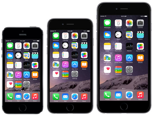
An iPhone 4 has a device-pixel-ratio of 2, meaning that one logical pixel length gets translated to the length of two rendered pixels. Therefore, one logical pixel (which is one pixel wide and one pixel high) translates to four rendered pixels (two pixels high and two pixels wide). Other devices have device-pixel-ratios of 3 or 4, so one logical pixel can be rendered as 9 or 16 rendered pixels.

At this point, you could assume that we're done, but not quite yet. One additional thing is about to happen: rendered pixels have to be drawn on an actual screen.

Physical Pixels

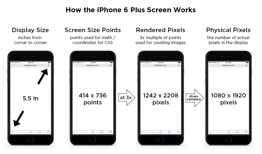
For most devices, showing rendered pixels on a physical screen involves no additional translation. The size of a rendered pixel is equal to the size of a physical pixel on the screen. This is not the case for all devices, however. Some devices (such as the iPhone 6 Plus, or a Retina MacBook Pro with scaled resolution enabled) render pixels at a higher pixel density (and thus at a smaller pixel size, but a larger image size) than the actual screen can display. When the rendered pixels are shown on the screen, the rendered image is scaled down to the size of the screen.

This website shows the kinds of graphical artifacts this can produce:
http://oleb.net/blog/2014/11/iphone-6-plus-screen/

PenTile Screens

For completeness' sake, I'll also add that a physical pixel does not always mean the same thing. On a normal screen, one physical pixel has three sub-pixels for the three colors shown by an RGB screen: red, green, blue. However, some screens (e.g. PenTile OLED screens) only have two sub-pixels per pixel. This means that one rendered pixel is often represented by more than one physical pixel, since the rendered pixel "borrows" a colored sub-pixel from a neighboring pixel.


Conclusion: Putting it all together

Logical pixels, set as component properties, are a unit of length roughly similar in size on different devices, and not an actual colored dot. Logical pixels are first translated into rendered pixels, and then scaled to actual device pixels, which then may be actual pixels with three different sub-pixels.


(The PaintCode website has a nice guide that explains this particular process — from logical pixels to rendered pixels to physical pixels — for iPhones.)

In reality, this level of fine-grained detail is only provided for informational purposes: All you need to know is that what Appway calls "a pixel" is actually not a physical pixel on a screen. Instead, it's a unit of length that is roughly the same size across different devices.

iPhone 6 Screen Size and Web Design Tips

http://www.kylejlarson.com/blog/iphone-6-screen-size-web-design-tips/

Apple updated its iPhone a bit ago making the form factor much bigger. The iPhone 6 screen size is both wider and taller and the iPhone 6 Plus also has a higher pixel density. This is an update to my previous post about designing websites for the iPhone 5. It’ll cover these new screen sizes and try to clarify how this all works.
Update: Apple has released the iPhone 6s and iPhone 6s Plus. The iPhone 6s screen size is identical to the previous iPhone 6 versions, so feel free to follow the existing sizes below.
Update 2: Apple has released the iPhone SE which is the same size as the iPhone 5.

iPhone Screen Measurements

There are a few different values to consider when looking at the iPhone screen sizes. I’m going to get these values defined here so the chart below makes more sense:
iPhone Display Size (inches) – This is diagonal measure of the screen, from corner to corner, just like you’d measure a TV.
iPhone Screen Size (points) – These points are the size that the device is using for coordinates. If you’re designing for the web (using CSS or JavaScript) these values will be helpful. iPhones use Retina screens which have a higher pixel density. This means they take the larger iPhone resolution (mentioned above) and compress those pixels into a smaller space to make the image look sharper.
iPhone Rendered Pixels – This is the full number of pixels that are being rendered. This is the value you get when you apply the multiplier (1x, 2x, 3x) the device uses to the screen size in points. If you’re creating an image and want it at the max resolution, this is the size you’d use. I’ve also written an article on Retina images if you’d like to learn more.
iPhone Physical Pixels – This is the actual screen’s pixel resolution. The iPhone 6 Plus is using a a larger image resolution on a screen with a smaller number of physical pixels, so it needs to be downsampled to this size. This value is really only important in a specifications perspective, but shouldn’t really affect your designs.
iphone 6 plus screen

iPhone Screen Size Comparison

This image shows the browser screen size of the iPhones for use when writing CSS. See the table below for all the measurements of each phone. If you’re using iOS 8 the Safari menu height is consistent across all the iPhones.
iphone 6 screen size

iPhone 4 iPhone 5(SE) iPhone 6 iPhone 6 Plus
Display Size 3.5 in 4 in 4.7 in 5.5 in
Screen Size 320 x 480 points 320 x 568 points 375 x 667 points 414 x 736 points
Rendered Pixels 640 x 960 (@2x) 640 x 1136 (@2x) 750 x 1334 (@2x) 1242 x 2208 (@3x)
Physical Pixels 640 x 960 640 x 1136 750 x 1334 1080 x 1920
Pixels Per Inch (PPI) 326 326 326 401
Browser Size Portrait 320 x 372 px
(320 x 440* / 320 x 460**)
320 x 460 px
(320 x 528* / 320 x 548**)
375 x 559 px
(375 x 627* / 375 x 647**)
414 x 628 px
(414 x 696* / 414 x 716**)
Browser Size Landscape 480 x 212 px
(480 x 280* / 480 x 300**)
568 x 212 px
(568 x 280* / 568 x 300**)
667 x 267 px
(667 x 335* / 667 x 355**)
736 x 306 px
(736 x 374* / 736 x 394**)
* – measurements with the small browser navigation bar
** – measurements without any browser chrome for a web app
Note that the iPhone 6 Plus is a 3x screen. For the previous iPhones you can double the screen size values to figure out the max size of your retina image, but on the iPhone 6 Plus you’ll want to triple that value (i.e. a full screen graphic would be 1242 x 2208).

Using the iPhone 6 Screen Size for Web Design

If you’re coding your site using Responsive design in order to fit the iPhone well, you may have some sizing issues if you don’t tell the device not to zoom in. You can do this by adding this viewport metatag into the head of your site:
<meta name="viewport" content="initial-scale=1.0">

iPhone 6 Startup Screen

If you’re going to be setting up your website so users can save it and run it as a web app you can add a startup image to display when the page is loading.
First add the web app meta tag (also make sure you’re not using a width in your viewport meta tag as this can cause issues):
<meta name="apple-mobile-web-app-capable" content="yes" />
Then create startup images at these sizes for compatibility with each phone:
iPhone 1 – 3gs: 320 x 460 px
iPhone 4 – 4s: 640 x 920 px
iPhone 5(SE): 640 x 1096 px
iPhone 6: 750 x 1294 px
iPhone 6 Plus: 1242 x 2148 px
Then add the code in your page’s header to link to them:
<link rel="apple-touch-startup-image" href="images/ios_startup.png"> 
<link rel="apple-touch-startup-image" href="images/ios_startup@2x.png" sizes="640x920">
<link rel="apple-touch-startup-image" href="images/ios_startup-large@2x.png" sizes="640x1096">
<link rel="apple-touch-startup-image" href="images/ios_startup-6@2x.png" sizes="750x1294">
<link rel="apple-touch-startup-image" href="images/ios_startup-6-plus@3x.png" sizes="1242x2148">

iPhone 6 Icons

When designing iPhone 6 icons you’ll notice there is a new size for the higher pixel density iPhone 6 plus. If you’d like to add an icon to your site that people will see when they save it to their homescreen, take a look at my article on creating an iPhone icon, which includes the sizes you’ll need.
====================

https://www.google.com/search?q=rendered+pixels+vs+physical+pixels&biw=1366&bih=633&tbm=isch&tbo=u&source=univ&sa=X&sqi=2&ved=0ahUKEwiAuKK19dXLAhVnKKYKHZYtCMkQsAQIPQ

The Difference Between Image Dimensions and Image Resolution?

Dimension refers to the actual measurement of the picture. Its width and height. This is measured in pixels, inches or cm.
The resolution of an image refers to the pixel density. It measures how many pixels there are per inch (or cm) of space on the picture.
If the picture is 200 pixels wide and it is also 2 inches wide, it would have a pixel resolution of 100 pixels per inch (ppi)

https://answers.yahoo.com/question/index?qid=20101122140629AAqZFMB

The differences between the iPhone 6 and iPhone 6 Plus and the earlier iPhone 5, iPhone 5c, and iPhone 5s

Reference:
http://www.everymac.com/systems/apple/iphone/iphone-faq/differences-between-iphone-5-5c-5s-iphone-6-6-plus.html
http://www.redmondpie.com/iphone-6s-plus-vs-6s-vs-iphone-6-plus-vs-6-vs-5s-specs-comparison/
http://www.gizmag.com/iphone-comparison-2015-2016/39467/ 
http://www.macworld.co.uk/review/iphone/iphone-6s-vs-iphone-5s-comparison-3628130/


iPhone 5s, iPhone 6 & iPhone 6 Plus - Front
Photo Credit: Apple, Inc. (iPhone 5s, iPhone 6, & iPhone 6 Plus)

iPhone 5/5c/5s & iPhone 6/6 Plus Comparison Chart
These differences -- design, biometrics, displays, durability, cameras, identifiers, connectivity, processor, and storage -- along with US pricing information is summarized below:
iPhone 5
5
iPhone 5c
5c
iPhone 5s
5s
iPhone 6
6
iPhone 6 Plus
6 Plus
Introduced: Sep 2012 Sep 2013 Sep 2013 Sep 2014 Sep 2014
Discontinued: Sep 2013 Sep 2015 Current Current Current
Clockspeed: 1.3 GHz 1.3 GHz 1.3 GHz 1.4 GHz 1.4 GHz
Processor: Apple A6 Apple A6 Apple A7 Apple A8 Apple A8
Architecture: 32-Bit 32-Bit 64-Bit 64-Bit 64-Bit
Coprocessor: None None M7 Motion M8 Motion M8 Motion
RAM: 1 GB 1 GB 1 GB 1 GB 1 GB
Orig. Storage (GB): 16/32/64 8/16/32 16/32/64 16/64/128 16/64/128
Current Storage (GB): N/A N/A 16/32 16/64 16/64
Battery Life (Hours): 8-40 8-40 8-40 10-50 12-80
Display Size: 4" 4" 4" 4.7" 5.5"
Resolution: 1136x640 1136x640 1136x640 1334x750 1920x1080
Pixel Density: 326 ppi 326 ppi 326 ppi 326 ppi 401 ppi
Contrast Ratio: 800:1 800:1 800:1 1400:1 1300:1
Dual Domain Pixels: No No No Yes Yes
3G Internet: Yes Yes Yes Yes Yes
4G/LTE Internet: Most Most Most Yes Yes
Wi-Fi (802.11): a/b/g/n a/b/g/n a/b/g/n a/b/g/n/ac a/b/g/n/ac
Bluetooth: 4.0 4.0 4.0 4.0 4.0
Rear Camera Mount: Flush Flush Flush Bump Bump
Rear Megapixels: 8 MP 8 MP 8 MP 8 MP 8 MP
Rear Aperture: f/2.4 f/2.4 f/2.2 f/2.2 f/2.2
Rear Pixel Size: 1.4µm 1.4µm 1.5µm 1.5µm 1.5µm
Rear LED Flash: Single Single Dual Dual Dual
Touch ID: No No Yes Yes Yes
Apple Pay (NFC): No No No Yes Yes
Barometer: No No No Yes Yes
Facedown: No No Yes Yes Yes
SIM Card: Nano Nano Nano Nano Nano
Original iOS: iOS 6 iOS 7 iOS 7 iOS 8 iOS 8
Fastest iOS: iOS 8 iOS 8 iOS 9 iOS 9 iOS 9
Maximum iOS: iOS 9 iOS 9 iOS 9 iOS 9 iOS 9
Primary Material: Aluminum Polycarb. Aluminum Aluminum Aluminum
Bendability: 130 lbs. 130 lbs.+ ~130 lbs. 70 lbs. 90 lbs.
Height: 4.87 in. 4.90 in. 4.87 in. 5.44 in. 6.22 in.
Width: 2.31 in. 2.33 in. 2.31 in. 2.64 in. 3.06 in.
Depth/Thinness: 0.30 in. 0.35 in. 0.30 in. 0.27 in. 0.28 in.
Weight: 3.95 oz. 4.65 oz. 3.95 oz. 4.55 oz. 6.07 oz.
Orig. Price* (US): US$199
US$299
US$399
US$99
US$199
US$199
US$299
US$399
US$199
US$299
US$399
US$299
US$399
US$499
Current Price* (US): N/A N/A US$0
US$49
US$99
US$199
US$199
US$299
 

The difference between iphone5 and iphone5s

Reference:
http://www.everymac.com/systems/apple/iphone/iphone-faq/differences-between-iphone-5c-iphone-5s-iphone-5.html

Internal Differences
The iPhone 5 and iPhone 5c are both powered by a dual core 1.3 GHz Apple A6 processor and have 1 GB of RAM.
Apple notes that the iPhone 5s has a 64-bit "Apple A7" processor and an "M7 motion coprocessor." Apple does not provide additional technical details, but the always excellent AnandTech was first to determine that the Apple A7 processor is a ARMv8 derivative of Apple's "Swift" dual core architecture called "Cyclone" and it runs at 1.3 GHz. It also is 28 nm, has a 64k/64k level 1 (instruction/data) cache and a 1 MB level 2 cache. AnandTech reported that the iPhone 5s models have 1 GB of RAM, too.
The iPhone 5 and iPhone 5s have 16 GB, 32 GB, or 64 GB of flash storage whereas the iPhone 5c have 8 GB, 16 GB, or 32 GB.
Originally, the iPhone 5c models shipped with 16 GB or 32 GB of storage, but on March 18, 2014, Apple added an 8 GB option, only in the UK, France, Germany, Australia, and China. On April 16, 2014, as first spotted by 9to5Mac, Apple quietly added the 8 GB iPhone 5c model in Austria, Belgium, the Czech Republic, Denmark, Finland, Hungary, Italy, Ireland, Luxembourg, the Netherlands, Norway, Poland, Portugal, Spain, Sweden, and Switzerland.
On September 9, 2014, Apple rolled out the 8 GB configuration of the iPhone 5c worldwide and discontinued the 16 GB and 32 GB options. Apple also discontinued the 64 GB configurations of the iPhone 5s. On September 9, 2015, Apple discontinued the iPhone 5c altogether.
Consequently, the currently shipping iPhone 5s models only have 16 GB or 32 GB of storage. Of course, on the used market, all other capacities are available, too.

iOS Support Differences
The iPhone 5 models fully support iOS 6, iOS 7, iOS 8, and iOS 9 but the iPhone 5c and iPhone 5s models only support iOS 7, iOS 8, and iOS 9, without any support for earlier versions of the iOS. However, note that if any of these iPhone models have been updated to a later version of the iOS it is not simple to "downgrade" to an earlier version without resorting to "jailbreaks" or other hacks.

Comparison Chart
These differences -- materials, biometrics, cameras, identifiers, battery life, connectivity, processor, and storage -- along with pricing information are summarized below for your convenience:


iPhone

5

5c

5s
Intro Date: Sept. 12, 2012 Sept. 10, 2013 Sept. 10, 2013
Disc Date: Sept. 10, 2013 September 9, 2015 Current
Processor: Apple A6 Apple A6 Apple A7
Cores: Dual Cores Dual Cores Dual Cores
Coprocessor: None None Apple M7
Original Storage: 16, 32, 64 GB 16, 32 GB 16, 32, 64 GB
Current Storage: Discontinued Discontinued 16, 32 GB
RAM: 1 GB 1 GB 1 GB
GSM/EDGE: Yes Yes Yes
UMTS: Yes Yes Yes
HSDPA: Yes (DC-HSPDA) Yes (DC-HSPDA) Yes (DC-HSPDA)
HSUPA: Yes Yes Yes
EV-DO: Some Models Some Models Some Models
4G/LTE: Yes (Most Models) Yes (Most Models) Yes (Most Models)
Bluetooth: 4.0 4.0 4.0
GPS: GPS/GLONASS GPS/GLONASS GPS/GLONASS
802.11n: 2.4 GHz/5 GHz 2.4 GHz/5 GHz 2.4 GHz/5 GHz
Talk Time (3G): 8 Hours 10 Hours 10 Hours
Battery (Web - 3G): 8 Hours 10 Hours 10 Hours
Battery (Web - 4G): 8 Hours 10 Hours 10 Hours
Battery (Wi-Fi): 10 Hours 10 Hours 10 Hours
Battery (Music): 40 Hours 40 Hours 40 Hours
Battery (Video): 10 Hours 10 Hours 10 Hours
Standby Time: 225 Hours 250 Hours 250 Hours
SIM Card: Nano Nano Nano
Original OS: iOS 6 iOS 7 iOS 7
Fastest OS: iOS 8 iOS 8 iOS 9
Maximum OS: iOS 9 iOS 9 iOS 9
Facedown: No No Yes
Biometrics: No No Touch ID
Front Camera: 1.2 Megapixels (1.75µm) 1.2 Megapixels (1.9µm) 1.2 Megapixels (1.9µm)
Rear Camera: 8 Megapixels (1.4µm) 8 Megapixels (1.4µm) 8 Megapixels (1.5µm)
Aperture (Rear): f/2.4 f/2.4 f/2.2
LED Flash (Rear): Single Single Dual (True Tone)
Panorama: Yes Yes Yes
Slo-Mo: No No Yes
Burst Mode: No No Yes
Materials: Glass/Aluminum Polycarbonate/Steel Glass/Aluminum
Dimensions: 4.87 x 2.31 x 0.30* 4.90 x 2.33 x 0.35* 4.87 x 2.31 x 0.30*
Weight: 3.95 oz. (112 g) 4.65 oz. (132 g) 3.95 oz. (112 g)
Model No: A1428/A1429
A1442
A1532/A1456
A1507/A1529
A1533/A1453
A1457/A1530
Price (Intro): US$199, $299, $399† US$99, $199† US$199, $299, $399†
Price (Current): N/A N/A US$0, $49†

Tuesday, March 22, 2016

Chapter 3 Static Techniques

K1: remember
K2: understand
K3: apply
K4: analyze

3.1 Static techniques and the test process

Terms

Dynamic testing, static testing

During static testing, software products are examined manually, or with a set of tools, but not executed.

Background

Any software work product can be reviewed, including requirements specifications, design specifications, code, test plans, test specifications, test cases, test scripts, user guides or web pages.

Advantages:

- Start static testing early in the life cycle, early feedback on quality issues can be established. Ex an early validation of user requirements.
- By detecting defects at an early stage, rework costs are most often relatively low and thus a relatively cheap improvement of the quality of software products can be achieved.
- Since rework effort is substantially reduced, development productivity figures are likely to increase.
- There is an exchange of information between the participants.
Static test contribute to an increased awareness of quality issues.

In conclusion, the quality improvement is not achieved once but has more structural character. The feedback from the static testing process to the development process allows for process improvement, which supports the avoidance of similar errors being made in the future.

Thursday, March 17, 2016

12 essential skills for software architects

Severus' session:

Chapter 1
Gracious behavior


How would others describe you is the core value you need to build yourself.
The good way to build yourself is to become a gracious professional.

Learning to delegate.

Life is reflexive: listen, don't defend, be gracious.

Life or death for effective communication: always choose to respond in a gracious fashion. Reflect a positive response even when you receive negative messages,


Don't bury issues.

Forgive and forgetting past offenses.

Key point:
Part of building relationships is graciously accepting feedback.
Do others as you would have them do to you.


Principle compilation on 17 Mar 2016

Reading is to widen your knowledge, use your brain to look at problems sensitively and flexibly.
---
It takes 21 to 66 days to form a habit.
---
When you feel boring during doing a thing, remember to the purpose making you do it.
---
Whenever you make a change, you must consider two factors: emotion and reason.
Emotion is the one you like, reason is the one you want.
Considering what you want shows maturity.
---
People make title, do not judge people via title.
Do not chase the title, chase the value.
Do not chase the money, follow the value you want to create.
----
Success is to live healthy, happy and know to start with why.
---
Manager has the first task to develop his/her member, to grow people.
---
It's better to breathe with your stomach.
---
Do not have the thought that you don't change yourself but you expect everything changes.
The mindset of different levels are different each other.
---
Do not change all your good or bad habit at the same time.
Change one bad habit per month on average.
---
The more you delay your good habit, the more suffer you have in the future.
---
Shouldn't stay up late, should get up early in the morning.
---
Three important skills to become a manager: communication, communication, communication.
---
Face your fear, solve it. Don't let your emotion dominate your personality.
---
Don't use the word "try", just do.
---
Do not let you be lacking in awareness, because it will help you understand the root cause of a problem, know what you are.


David's session


Saturday, March 5, 2016

Session on 4 Mar 2016

A Thành shared us:

- Always start with "why".
- Remember everything has a price.
- A quote "Life is a full of choices".

- Our life revolves around